Eva C. Sours
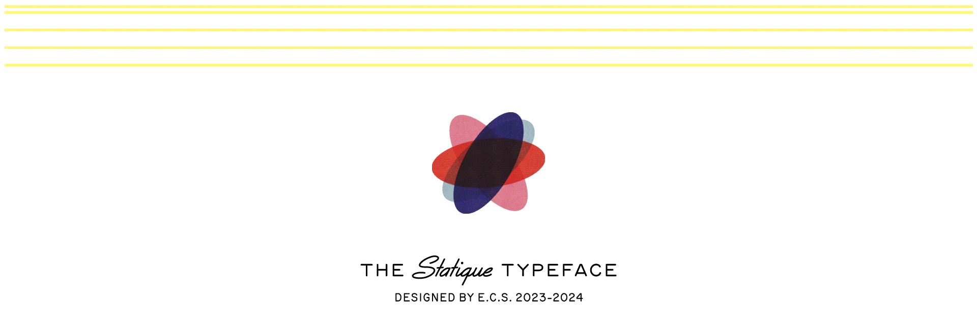
Statique
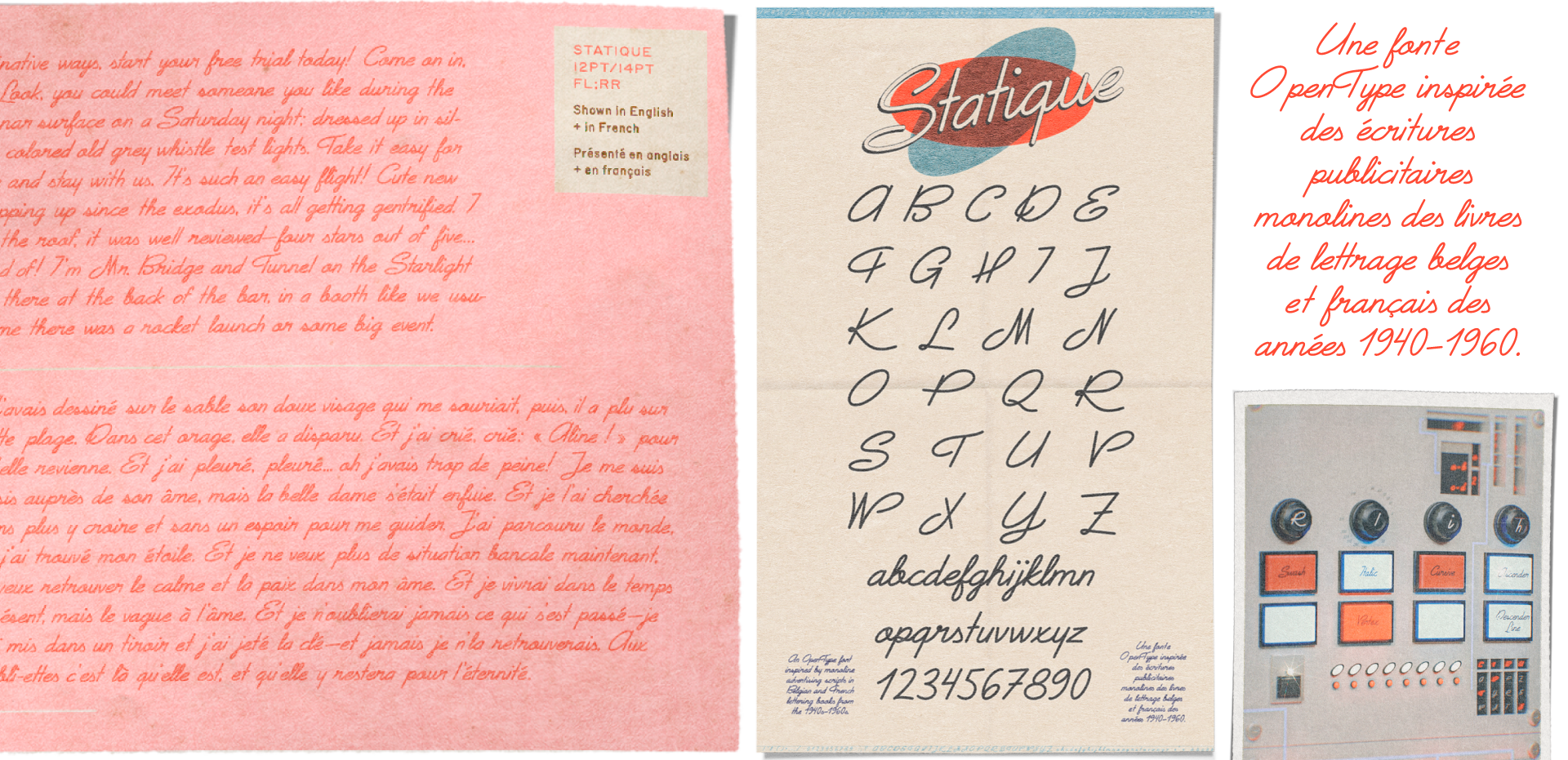
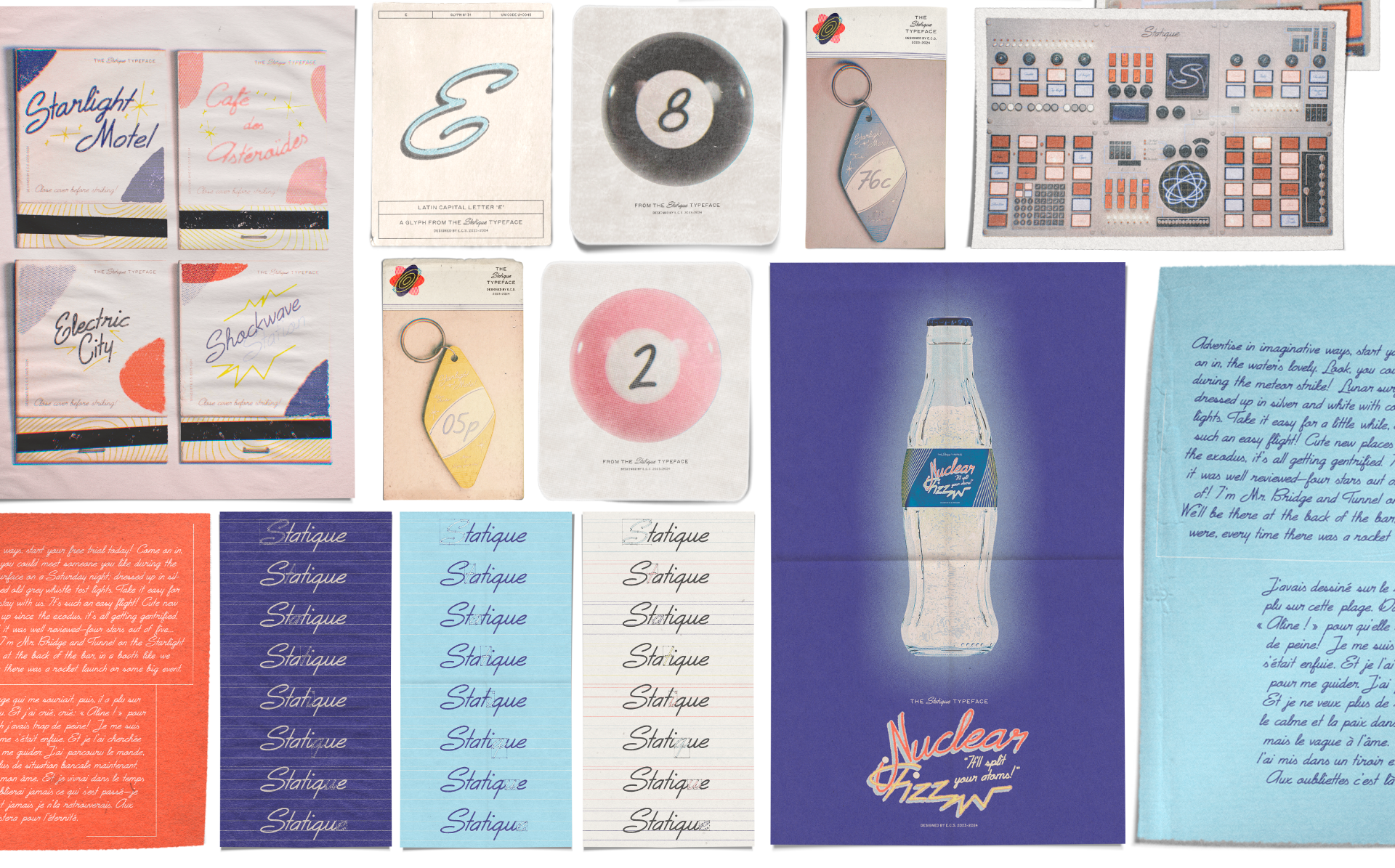
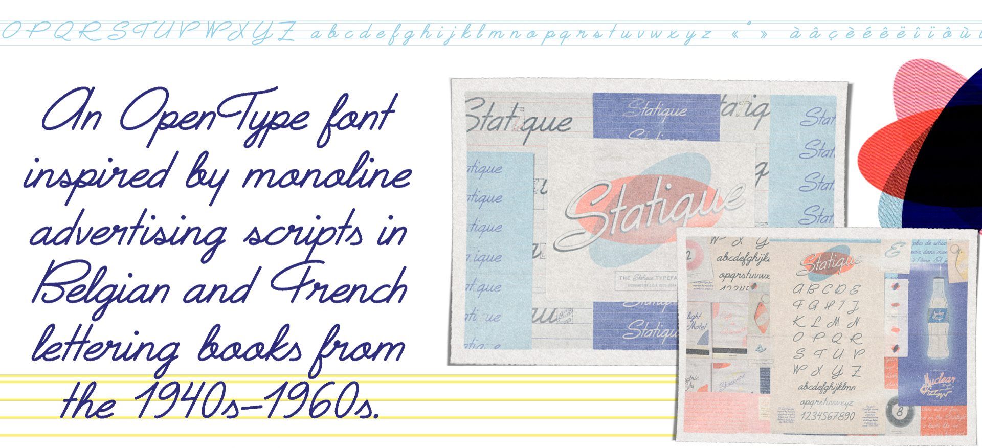
Driven by my interest in typeface design and searching for ways to consider my Belgian identity in design, Statique is a connected italic typeface designed inspired by the countless lettering books I looked through for inspiration. At 196 glyphs, it can be used for both English and French text. Designing Statique allowed space for me to explore typeface design and to find a method to combine my two cultural identities, without any language barriers.
Artist/Thesis Statement
My initial interest in different typefaces began when I was a child and clicked on the drop down menu for font options on Microsoft Word. When I was 11, I discovered dafont.com, and after scrolling through many pages of different styles of fonts, I attempted to make a font from my own handwriting, using a website that would make a .ttf file from the printed & scanned template they provided. I remember it came out jagged (a result of probably using an old ballpoint pen that was lying around) and my letters looked a bit wonky (my handwriting has never been one of great consistency), so evahandwriting2013.ttf didn’t come out they way I had in mind, but I was super excited about it anyway. During the course of my BFA degree, I found myself similarly gravitating towards the world of fonts and typography. So, I challenged myself to see if I could produce a refined and consistent typeface, over a decade after my first attempt.
This project revolves around my design of a font named Statique. Statique is an OpenType font inspired by old monoline advertising scripts and named after the inspiration I found in Belgian & French lettering books from the 1940s–1960s.
Having a finished font file may be the conclusion to this project, but not an ending point for the font itself. The possibilities of using it are endless, and I’m excited to take on the challenge and satisfaction of typeface design with my first completed font, Statique.